Take a look at a selection of my recent projects, crafted with care and designed to make an impact. Each one tells a story of creativity, collaboration, and results.
Yolande Sep
Personal Signature & Artist book
Yolande Sep is an Artist based in Amsterdam, The Netherlands.
Her work is an exploration of non usual ways to interact with a canvas, different objects like feathers, brushes, clay & fire to manifest her visions, the mission:
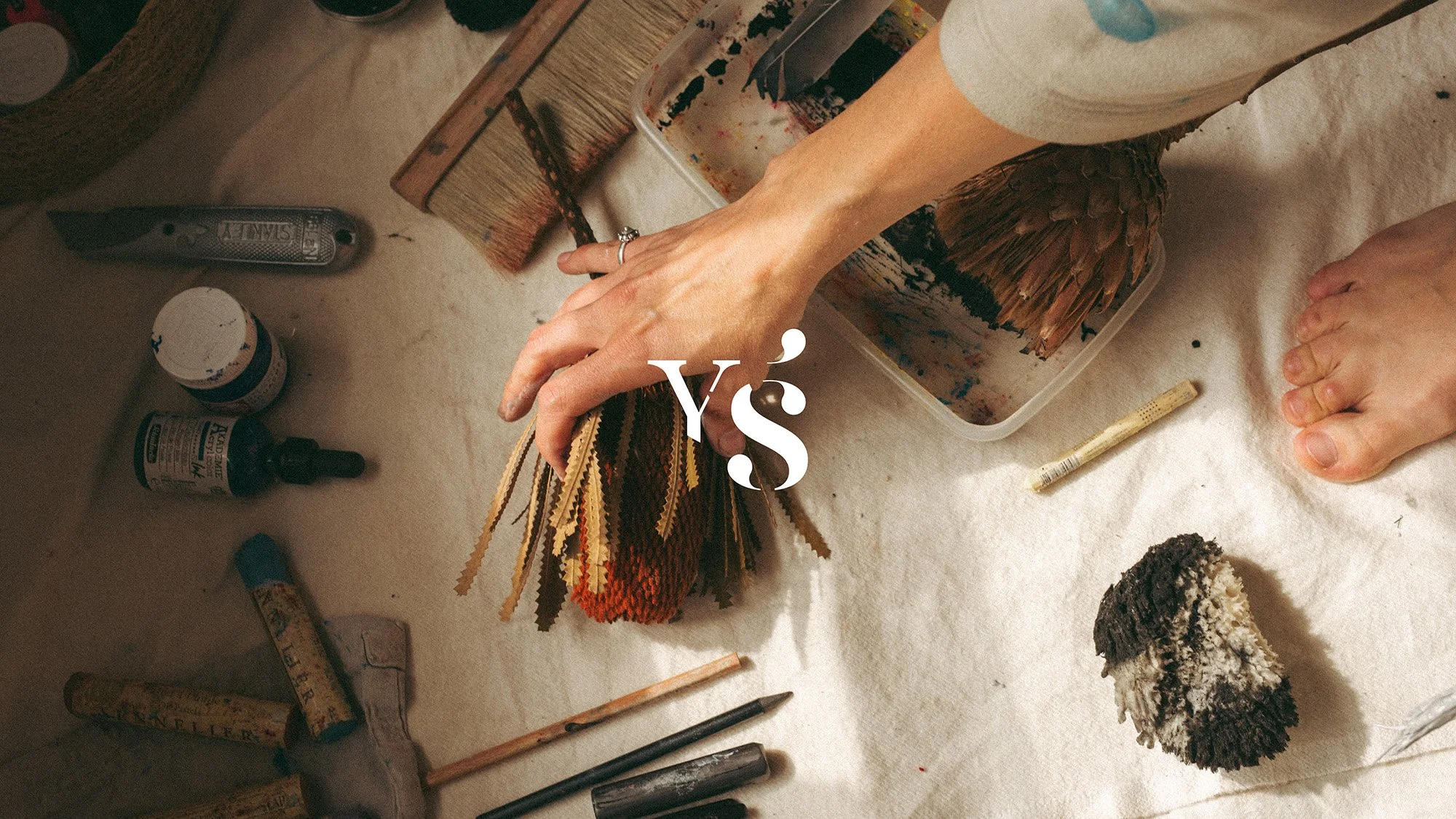
A symbol that could represent her essence, Abundance. Rooted like an olive tree. A symbol of nourishment, continuity, connection, and life that keeps expanding through relationship. The snake. Carrier of transformation, intuition, wisdom, and living knowledge. An ancient force of renewal, movement, and becoming.

The Art Book
Yo Sep’s second collection
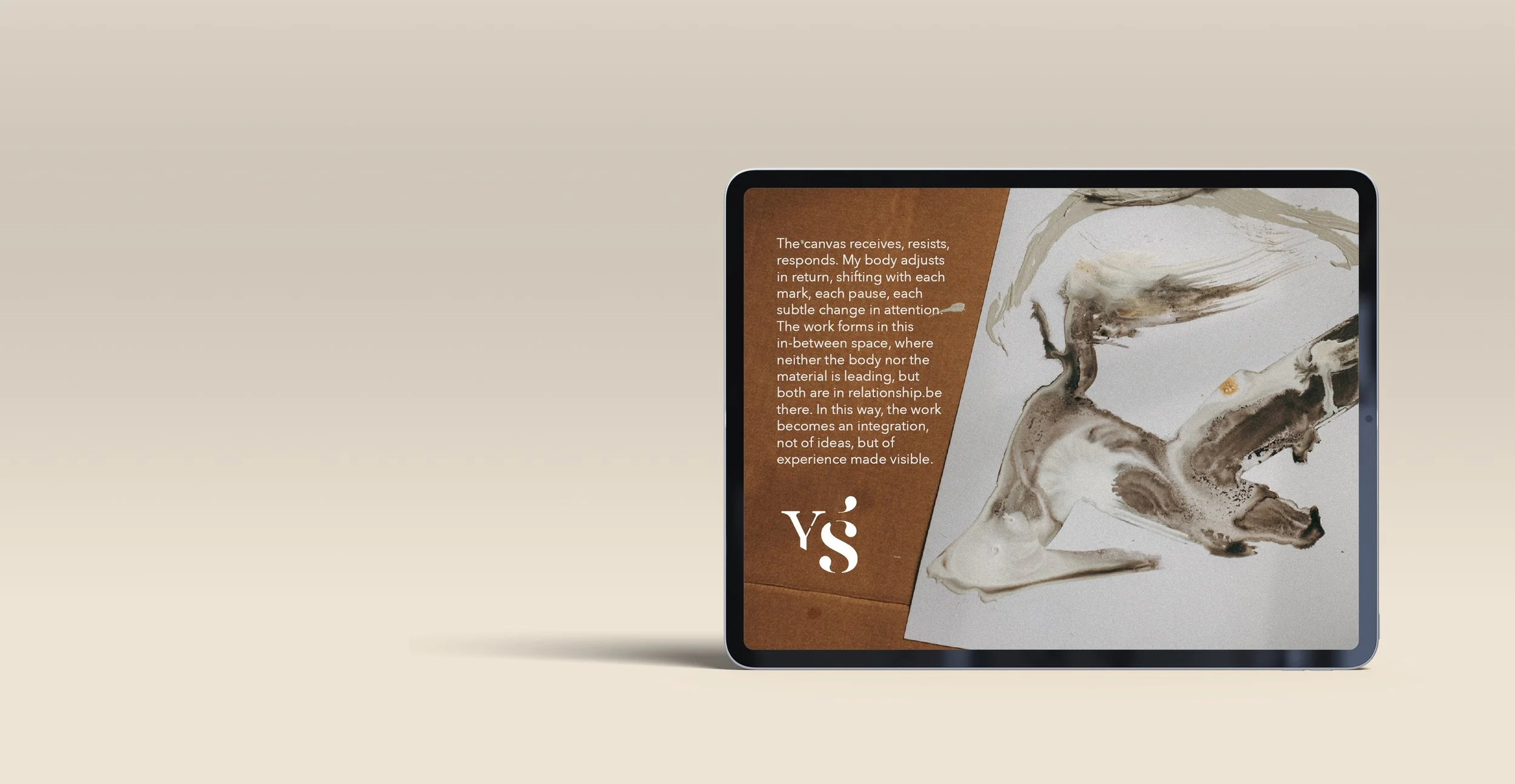
Yo Sep asked to the Dutch photographer Olga Esser to frame the experience of her last collection, the Art book's intention was about a new way to see herself as an artist, and a new way to show her work on different canvas, the edition of the renders was made with adobe illustrator. Olga is an amazing photographer, was a pleasure to use her photography as a canvas.
The Tee C.
Branding and Brand Mentoring
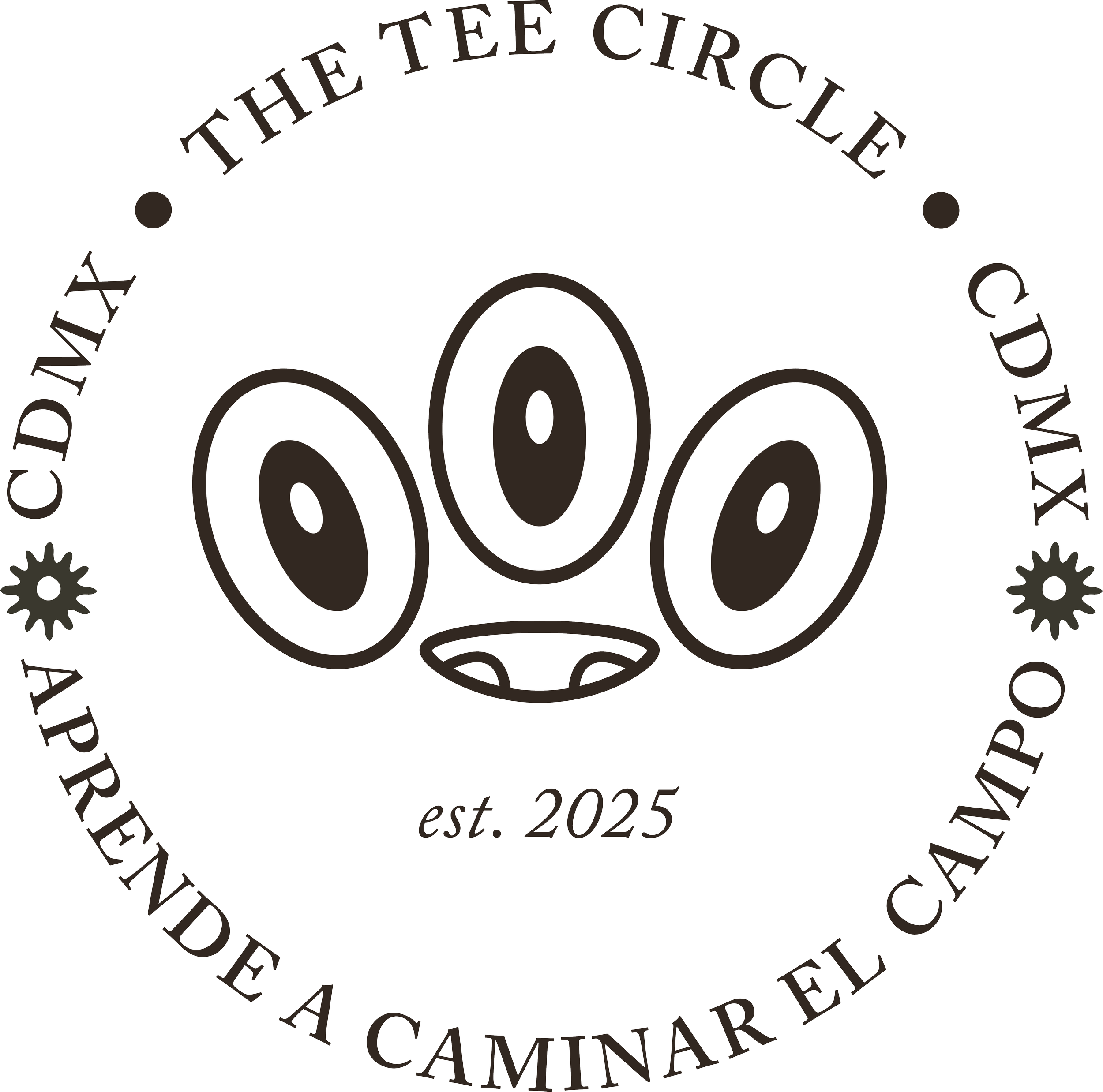
The Tee Circle is a golf club based in Coyoacán, Mexico City.
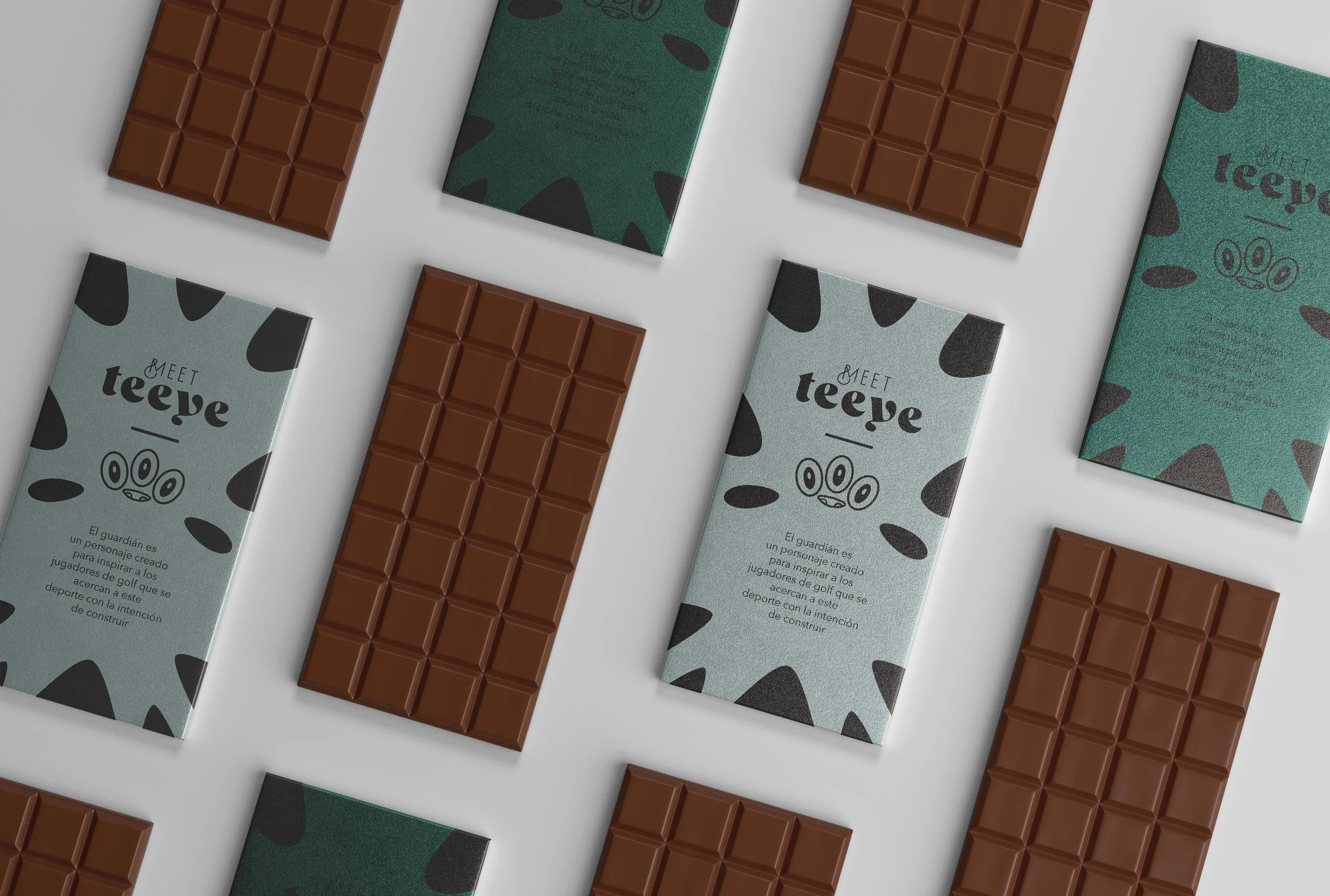
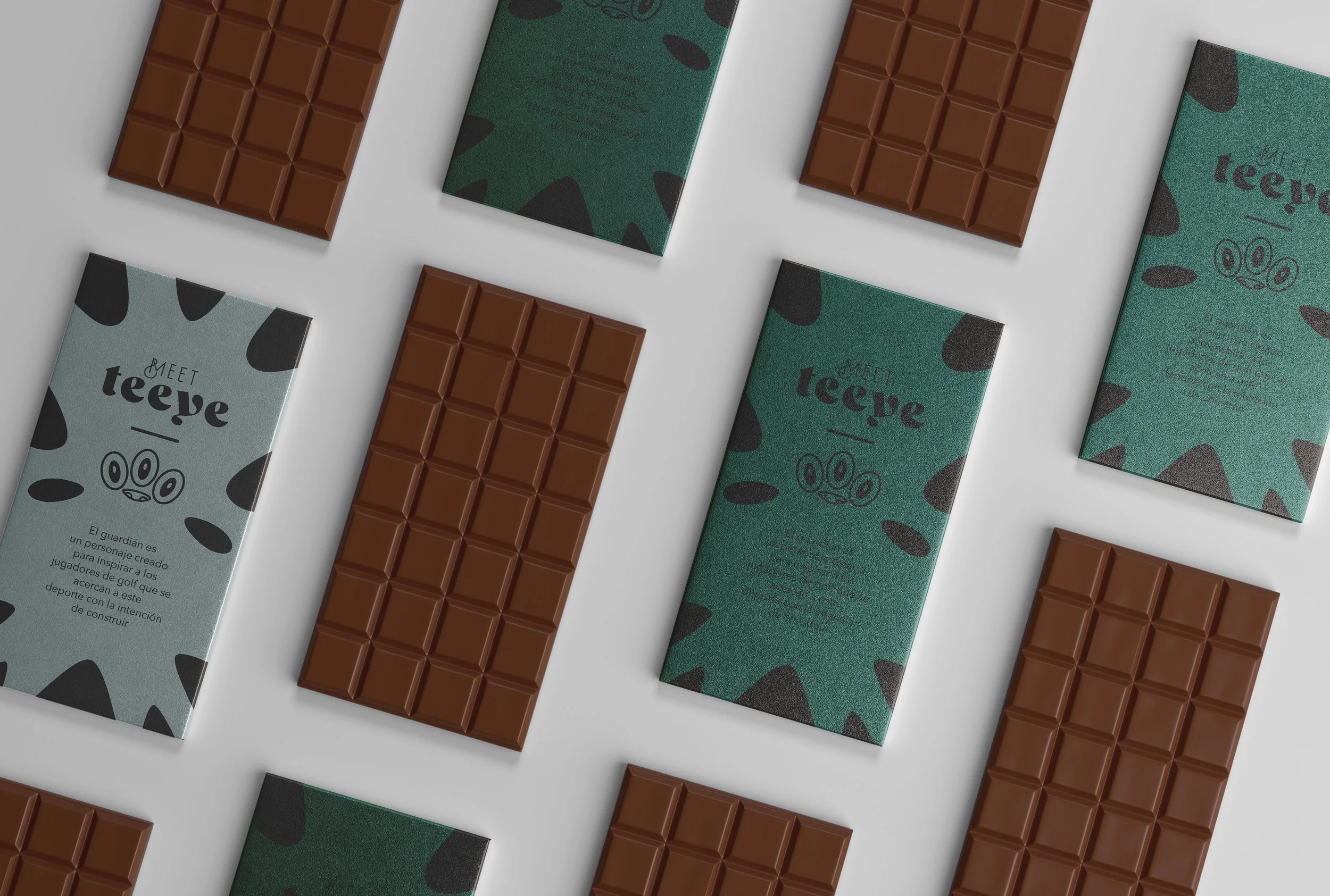
The club’s Founder & CEO is Alberto Padierna, Designer and art lover. His first manifestation was the creation of a character called Teeye, created by Mexican Artist Mr. Mitote, having as consequence the creation of an Art Toy.
“Learn to walk the field” as the main intention of the club, Golf is a way to get to know interesting people with particular interest, and particular conversations, more than a traditional club, it’s more a fraternity, with shared philosophy, business mindset and similar interests.
While getting to know Alberto’s intentions, all the visual dialectic was created inspired on this vision, and complementing the possibilities of the brand, creating a platform of products based on the Circle values.

Wiphala S.
Branding & Art Direction
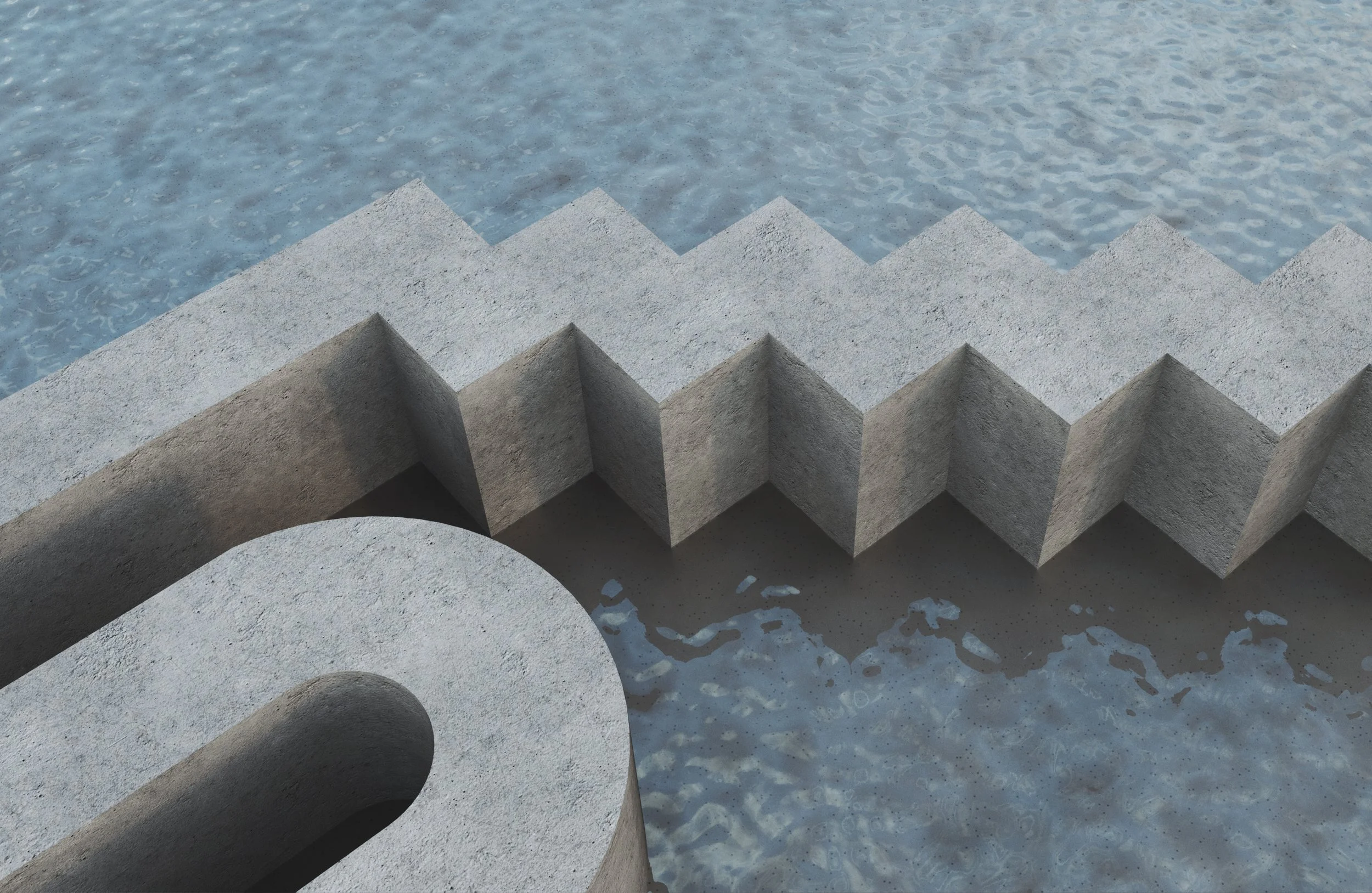
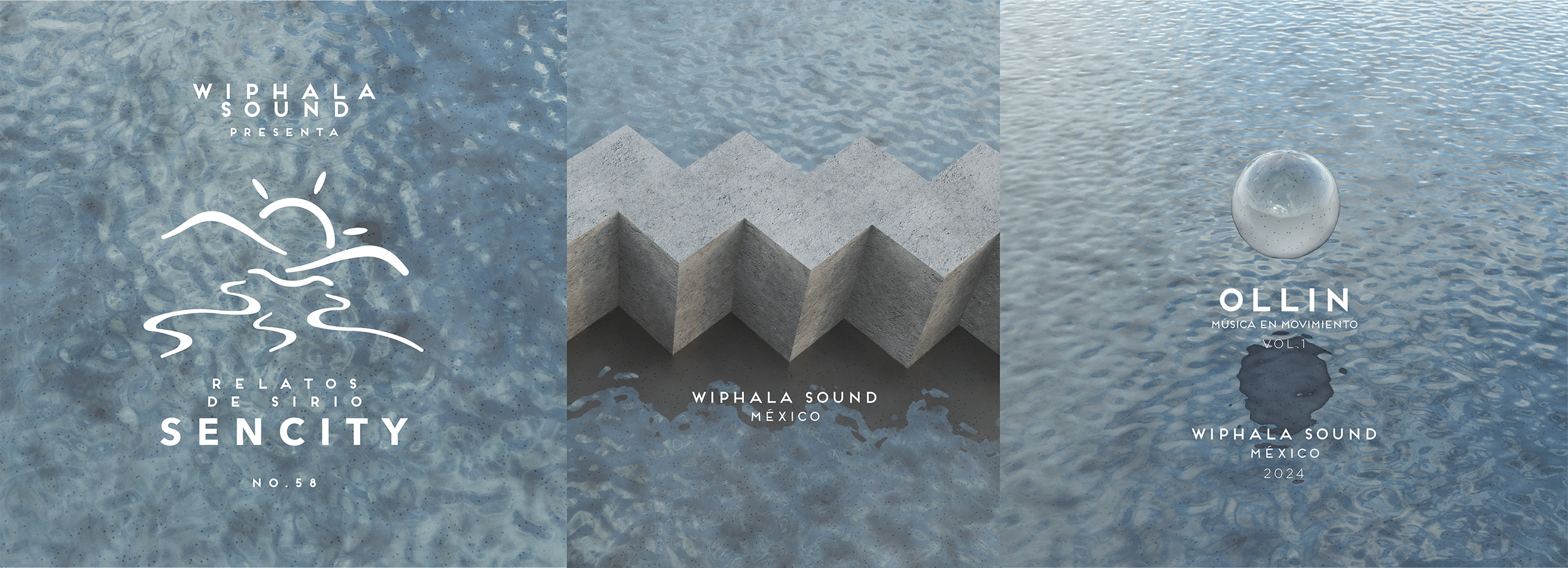
Wiphala Sound is a Music Label based in Mexico City.
Founder by DJ & music producer ZAC, created as an artistic platform of sound diversity that seeks to share, promote, and support the music of emerging artists around the world, for contributing to the re-connection of galactic consciousness through of the art and culture as collective tools. Inspired by the Wiphala flag, as the movement of the indigenous civilizations of the south.

Ruralista
Branding, Art Direction,
Photography & Editorial Design.
Ruralista is a Design Brand based in Guanajuato, Mx.
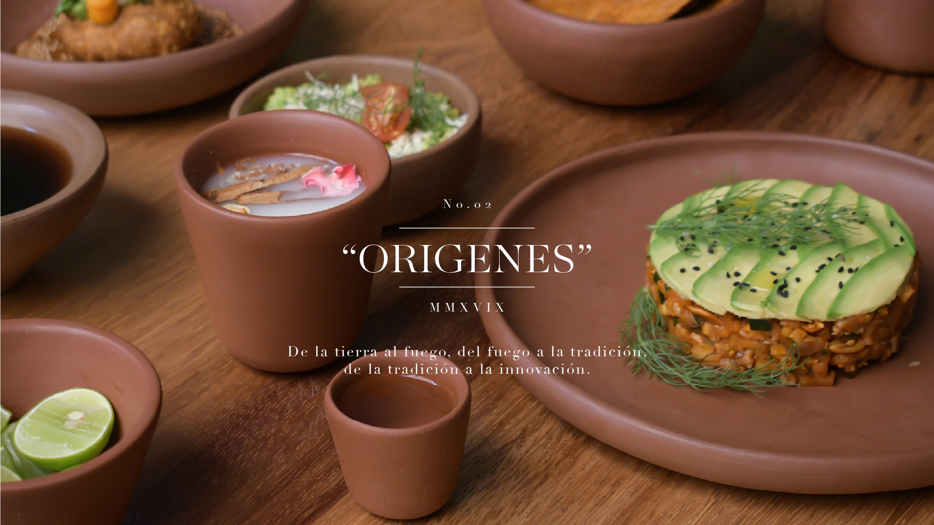
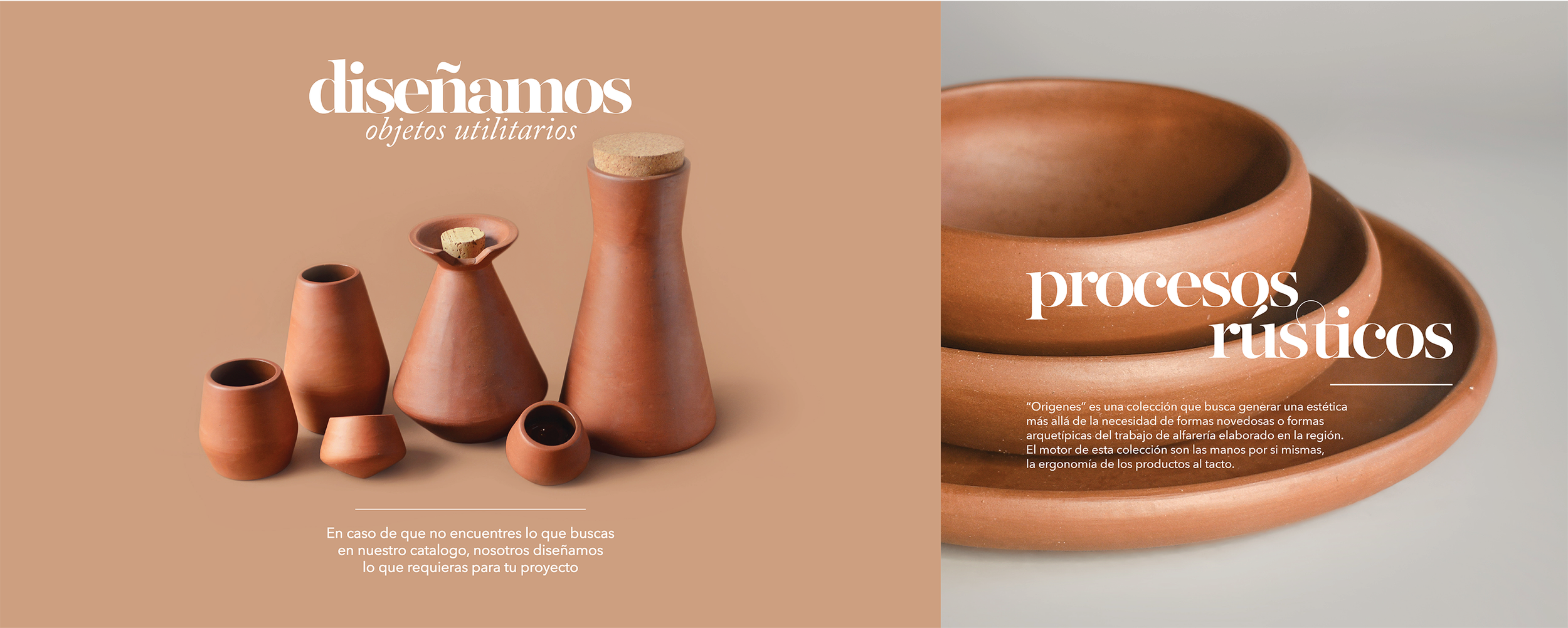
The brand is focused on the Mexican Crafts, understand the traditional crafts to power them of new aesthetic DNA as a way to preserve traditions and help the artisans.
Hard work and resistance is part of their values, for the Art direction I decided to work with different Chefs from different regions, to use their design products as a canvas and as consequence of this feel a new and fresh perception of the Mexican Culture.
Forces
of the Universe.
Graphic creation for Rossenham a worldwide project.
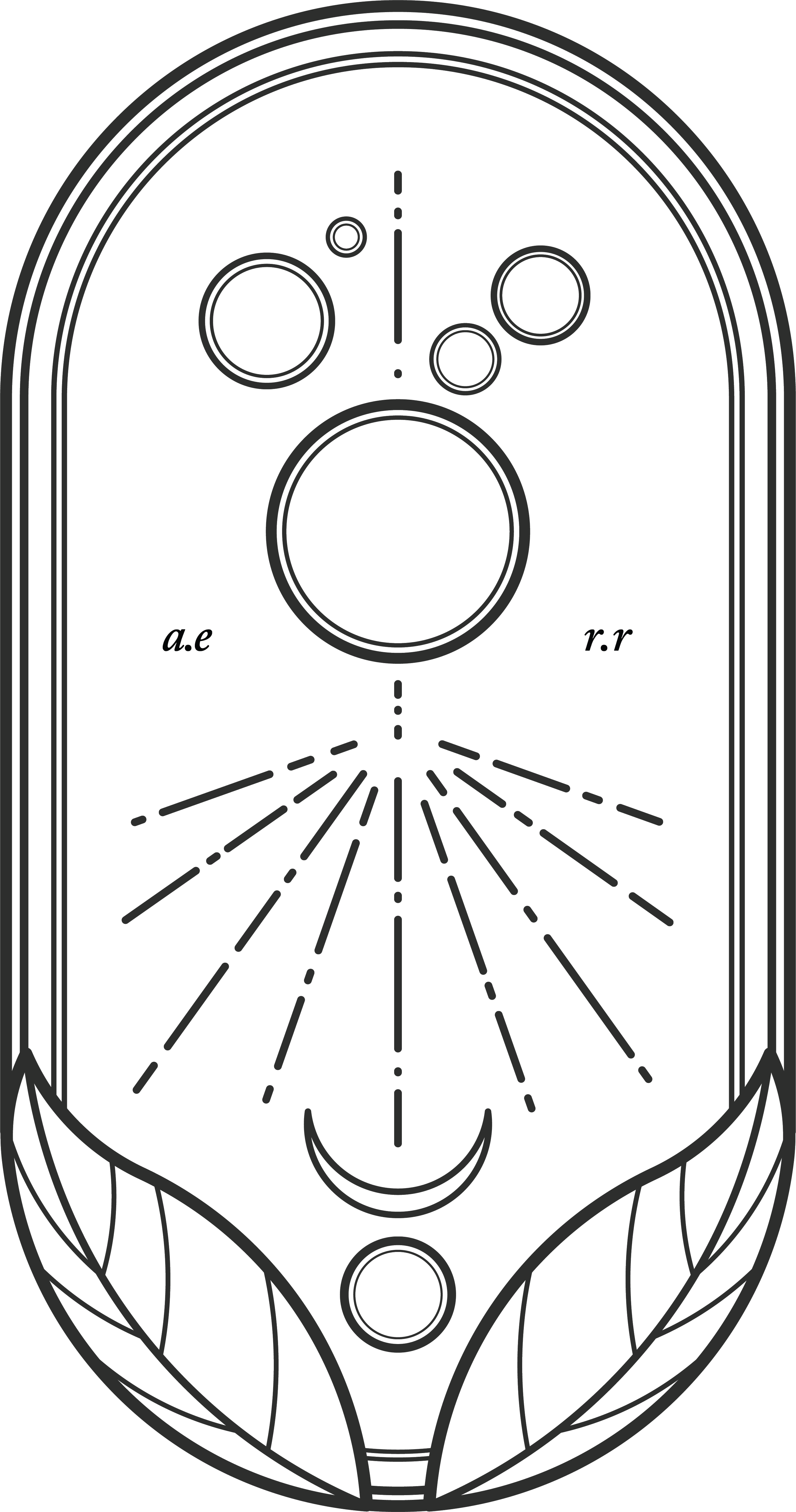
This blazon was designed for my anthropological brand called Rossenham, manifesting different elements as symbols of manifestation:
From the universe I receive the knowledge, the Moon is the keeper of the deepest secrets, and Nature is my nest.
I think it’s beautiful to create self manifestations as a way of understanding how we are sealing this beautiful sea called “the mistery” of what means to be alive…